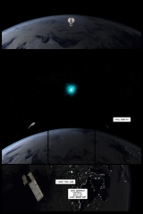
20141223, 09:29 – Setting up this page and the next for re-rendering this afternoon. I’ve always hated how the original version of these two pages turned out, and after extensive editing of The Dualist got spacey and touched on Dead City Radio I figured it was time to give Transitional Voices a look.
The line art for Earth is terrible; there’s no denying that and there’s nothing I can really do about those design decisions that doesn’t amount to a full redraw. I can, however, fix the shit out of these two pages, replacing a bland layout with a better layout in the name of SCIENCE!. Red shift isn’t bright red, dammit!
TV.1 is at a weird resolution – the pages are 2250×3375@365dpi, and it’s the only chapter built at that resolution that’s still at that resolution. The first edition of The Dualist was 2250×3000; the second edition came down to 1849×2274@300dpi. Most of Dead City Radio and the rest of Transitional Voices has a “web select” area of 2944×4417@480dpi, and all of DCR and Water onward have been built at print resolution – that is, the pages have big honking gutters and can be dropped into a properly sized layout thinger and printed without any of that annoying prep work. Earth predates that decision, so I’ve had to convert these pages into full print guttered versions in order to get what I need for the layout – while I don’t know if it’ll work or not yet, the idea is for the last panel of this page and the last panel of the next page to form a spread and that will only work if the spacing is halfway correct in print and that can be approximated with gutters so these two pages are being properly formatted and the rest of the chapter will just have to wait. Or, you know, not be properly formatted. Since there are no other spreads or spread-like paneling in this chapter it doesn’t really need to be.
10:00 – Both pages are ready for rendering; I’m going to not do that for awhile.
21:00 – Everything’s rendered; the first four panels of this page have been assembled. Down to shoopin’ but dinner first.
22:02 – Fuck yeah that’s arty. Revised extensively from the initial layout, though the framing (wide narrow narrow narrow wide repeat) remains.
20141224, 10:54 – I should probably ship this. I haven’t actually done anything with it for the past twelve hours.
14:12 – You can see the original page in the attendant blog post.
Original page metadata:
West said it was red in reverse. Boy is it red.
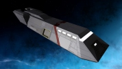
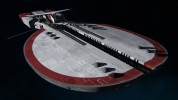
Rendering-wise, panel three would be the Daedalus’s exit vector, and panels four and five are (obviously) the Sabrosa’s. Aesthetically, I did it this way to cover up texturing issues that crop up with the cloud map when the tiling is increased – it looks like total ass unless you’re close up… in which case, the untiled map looks horrendous and the tiled map looks spiffy. Hence the “jump cut.”
That’s CG for you, I suppose.
Nice to bust out a lineart-free page. It’s been awhile!
No telling when the next one will be up – the last panel took forever and ever to render, and that doesn’t bode well for the next few panels!
Mastering notes, 2016.12.07 – Rewrote the last line of panel two.


