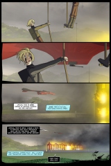
2008.07.08 – Redrew the linework, rebubbled the type, and made a few other minor adjustments. It’s a huge improvement over the original. Fo rizzle.
===========================
Originally laid out as four horizontal panels, then recut for two vertical for aesthetic reasons – the Sabrosa just fits better this way.
The linework was fed through Illustrator CS2’s “Live Trace” feature, which approximates Streamline, Freehand and Flash’s trace functions. Control is theoretically “better,” though I’m having some serious line weight control issues with this initial outing. I’ll be doing the next two pages – the remainder of this scene – with this method, so if it doesn’t work out, the comic will be back to the traditional look and feel with page six.


