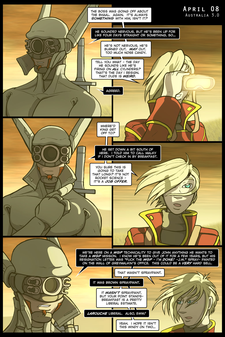
Fairly straightforward, going more for cropping than scaling. In this case the linework is separated from the backgrounds – usually the second edition panels are merged, though in this case I figured keeping the art and backgrounds separate would give me some wiggle room for type… and also makes it easier to patch Raven’s hair. Tantek’s been nudged around a bit and Raven’s been scaled down a lot, particularly in the last panel. You can thank that HUGE PILE OF WORDS for that. So many words.
At least they’re words about poo. There’s that.
Also, the fingers on the faceplate in panel five? Those are new. Slightly more of an explanation on the next page, but long story short? I done went and fixed a fairly non-trivial bit of visual continuity. The left (his right) looks better than the right (his left)… to get something better I’d probably have to draw it out by hand, scan it in, etceteras. And who needs that?
Mastering notes, 2016.12.06 – Minor caption and dialogue adjustments.


