New Words (2014.08.03)
This page was originally posted as page one of a two page spread on July 6th. It’s been re-tooled and is being re-posted as page one of a four page spread on August 3rd. I’d love to say that production will resume in short order and that the next page will be up on August 10th but at this point I don’t know what my universe is going to look like on that date. Hell I don’t even know what it’s going to look like in twelve hours. I figure that since this page has been redone it’s better to make a bit of noise now instead of sitting on it until the page that follows is ready to post. I don’t know when that’s going to be – I’ve scrapped the scene and created fresh, streamlined layouts but have yet to start panel production. I don’t know when I’ll get into it – I could find myself with the wherewithal tomorrow. Possibly next week, next month, or even next year.
I’d write about the particulars hinted at in the previous paragraph but my life (and career) is presently in a state of quantum superposition. Sufficed to say, ATC is off schedule and while it will continue to update on Sundays I’m pretty sure it’s done being a weekly thing, at least for this scene.
Old Words (2014.07.06)
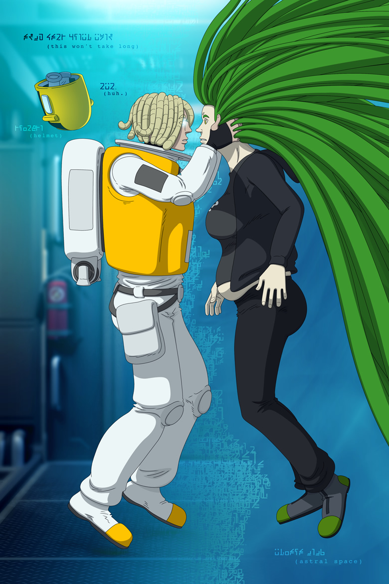
Page one of a two-page spread. The back and front are complete; the middle is on the next page and I haven’t started on that yet. As with previous two–page spreads I’ll show off the whole uncropped thing when the second page goes live, which should be next weekend. It’s really something – I haven’t done a spread like this or a sequence like this ever, and the fact that the framing turned out nicely ups the pressure on doing a good job on the rest of it.
I retconned the new Rhodhe font into the previous page, so it technically debuted there though this is the page I was facing when I realized it was going to be less effort to create a font for the scene than it would be to rely on hand lettering. I used the previous page as a baseline and generated the character set from scratch on the night of July 3rd, and turned it into a useable-for-this-scene-anyway font with a few hours of effort. I swear the damned thing just appeared – I haven’t been In The Zone like that in quite awhile!
The effort has already paid off, too – I can’t imagine how long it would have taken to create the rising tide of Rhodhe in the background by hand. I can’t imagine it actually saying anything of value, either – while the bits in the foreground are actually relevant and are words relevant to the scene, the background text is a whole lot of lipsum. It wasn’t in the original script – the effect was unthinkable when all Rhodhe was envisioned to be hand lettering. Now it’s not only thinkable, I’m thinking of expanding on it and turning it into a thing. Which kinda defeats the purpose of carefully writing around language in the story but hey it MIGHT BE COOL DAMMIT.
If you want to see a screenshot of the entire nearly-final Rhodhe character set you can follow ATC on Facebook.
Next week: the right half of the spread! The actual inside of Thad’s head! More squiggly writing, the full full-bleed spread, and hopefully some idea as to whether or not I’ll be eating this month! Stay tuned!
