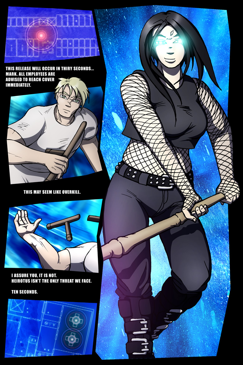
The in-panel PA I mentioned in the metadata for the previous page got rolling here in the first edition. Fortunately that effect (layer name: “expensive type,” where “expensive” means “time consuming”) wasn’t mated to the panels, so it was easy to ditch. You’re actually seeing more of the linework now, for whatever that’s worth.
If I was of a mind to redraw the scene – and I was, for a bit – you’d be seeing more of the “energy spear” thinger Val started to ramp up before Thad punted her back to Bedlam. It’s the kind of bling that looks good in a portfolio, I suppose.
Unfortunately (for the bling), I think I’ve reached the tipping point with the second edition – I’m much less about remaking every scene to be Perfect and much more about making it Suck Less. And ditching the inferior in-panel PA “effect” counts in that respect. It counts for a lot. It doesn’t, however, change the overtly avoidant composition of the scene. While that’s something that could be improved with a redraw, it’s my assessment that the potential gains are just that. Potential. The time involved, however, is a very real, very perishable, very Never Getting It Back And I’m Using Too Much Of It Already thing.
I’m willing to put in that time when it greatly adds to the story. I’ve committed to creating at least a dozen more new pages of The Dualist, plus some new renders here and there. All stuff that adds to the story and helps to flesh out the work. If I redid every panel I thought I could improve, well…
Actually, I am. Sorta.
Oops!
Oh, and. Tuned the HRD “occupancy” blips in panel one. Just a smidge.
Side note – why isn’t “smidge” a part of the default OS X dictionary? What’s up with that!
Mastering notes, 2016.12.06 – Minor dialogue adjustments.


