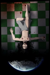
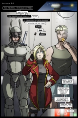
Reworked along the lines of the previous page, featuring an upside-down Australia for complementary flavoring. This keeps the segue while ditching the song lyrics, and has the added benefit of effectively filling space created by scaling the panels for width instead of height. The oz planetshot is a bit dark – I have no idea how that’s going to turn out in hardcopy.
Earth note: Normally I love rendering the planet against stars (it’s pretty), but in this case having it just hanging there against black really makes the composition.


