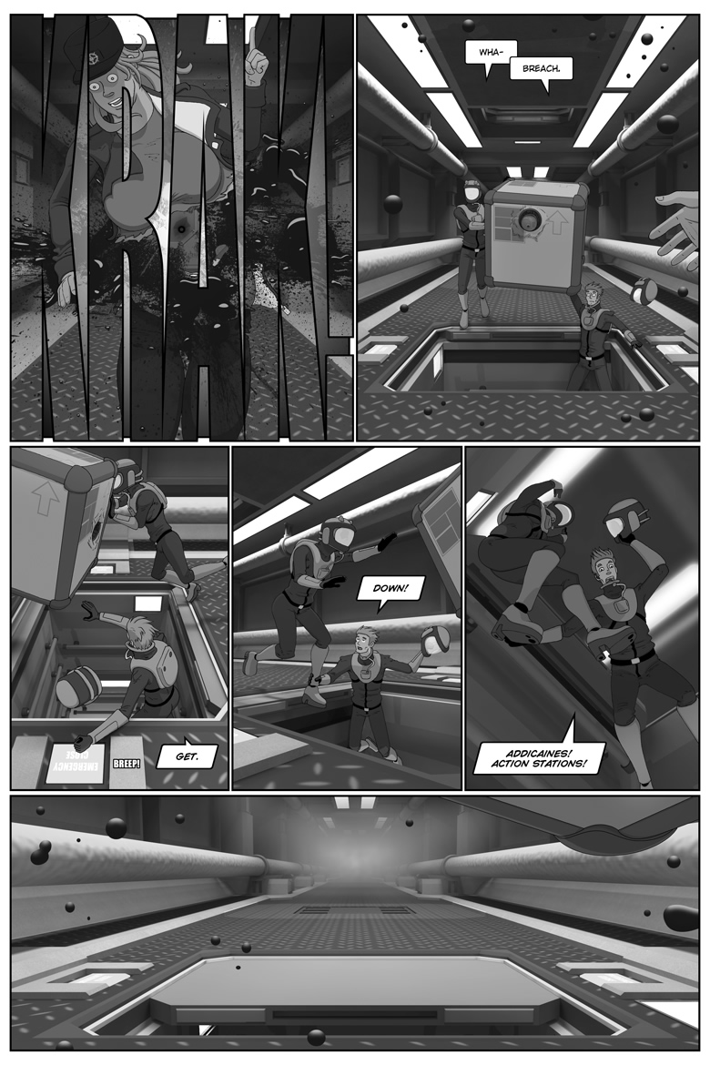
Tons of work here – from the BLAM!-style Big Sound to the revision of panels three through five to figuring out a reasonably tasteful means of visualizing gore, this one was a bit of a time sink. It took longer than I would have liked, but it’s done and I’m fairly happy with it. Even if a chunk of the gore in panel one does look a bit penile.
Arguably the goriest death to date, and the first bit of the old on-screen ultraviolence that doesn’t involve a head wound. There’s more coming up, but it’ll be a good long time before there’s another on-screen death in microgravity.
I went for “tasteful horror” in panel two – I drew the inside of the captain’s chest cavity with intestines oozing out, but ultimately discarded the art on grounds of anatomical issues and personal taste. The final panel leaves more to the imagination.
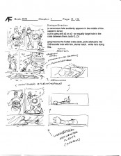
The layout was extensively revised. The first panel was tweaked to compensate for my think-through on the physics of a high velocity impact. I’m still off, but the existing panel strikes a balance between aesthetics and feasibility, and implies motion in a way the thumbnail doesn’t. The camera was trucked back in panel two for reasons touched on previously, and panels three through five were reworked to streamline action and to work with the realities of the environment – something the original layouts didn’t really take into account.
There’ll be more of that with the next three pages – the layouts for the end of the chapter are ultimately more of a suggestion than a Vision, and I’ll be revising the heck out of them. Partly to save time, but primarily to strengthen the visual storytelling. What I have in mind now is definitely spiffier than what I had in mind back when I was finalizing the script – you’ll see what I mean in a couple of days!


