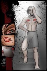
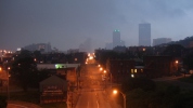
Minor layout changes – the top panel was cropped; everything else was scaled. I would have gone for a matching scale while extending the top panel, but this is one of those pages in which the oldest photoshop file is full of merged panels, so there’s nothing to deconstruct…. and nothing to gain by re-implementing the panel.
While the whole thing has rough edges*, I still love the look of the page, and wouldn’t mind doing a short project with this sort of look at some point down the road.
* I mean that technically, not just artistically. The threshold filter (which is how the backgrounds got their nifty look) hasn’t gotten the anti-aliasing memo yet. Not only that, it took me a long time to realize I ought to be ticking the “anti-alias” tickybox for the lasso tool when it came time to lay down panels with non-90-degree corners. Fortunately, I’ve moved on to newer and more exciting problems – with photoshop and with most of the rest of my tools.


