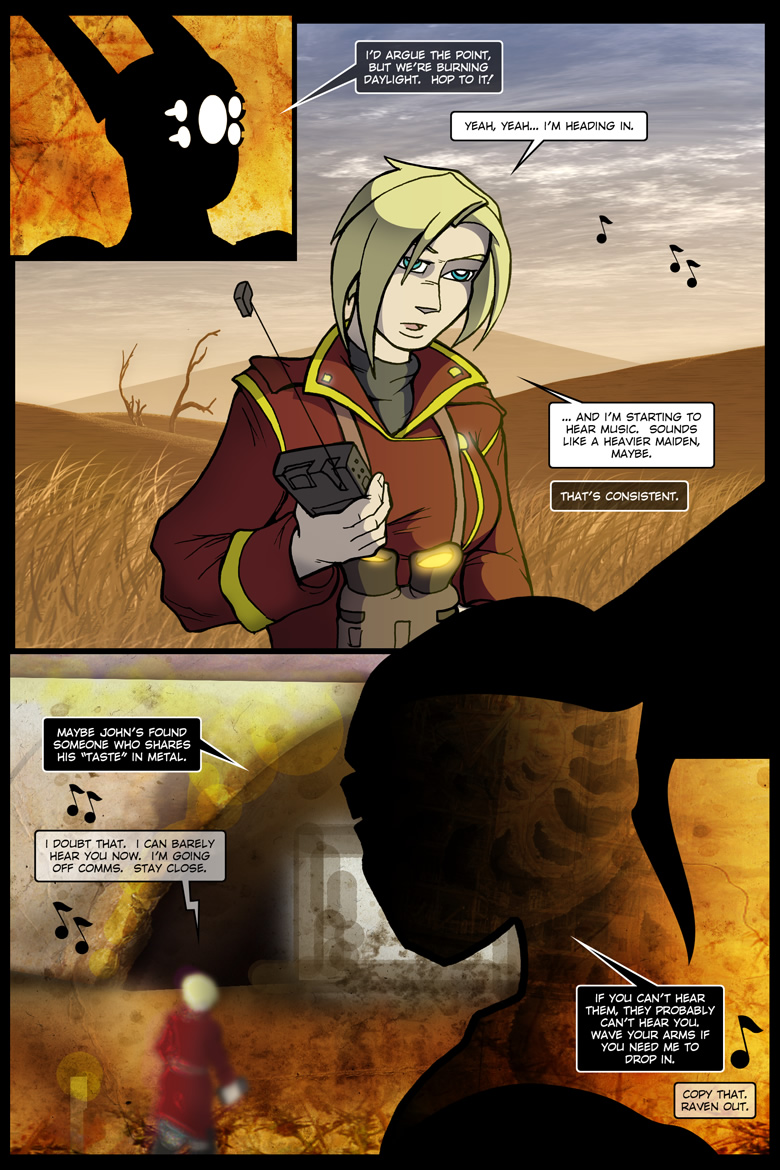
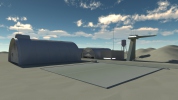
Raven got a LOT more headspace, and the bottom “panel” has been scaled a bit… but not too much. The advantage of straight-photoshop backgrounds? They’re a lot more malleable than the 3d stuff.
Continuity – Tantek’s optics now have the spiffy little side divots. While bits I’ve excised in Raven’s panels are still present in panels one and three, I feel they’ve been sufficiently manipulated as to beat little resemblance to their source material. They’ve also been significantly oranged-up.
Mastering notes, 2016.12.06 – Minor dialogue adjustments.


