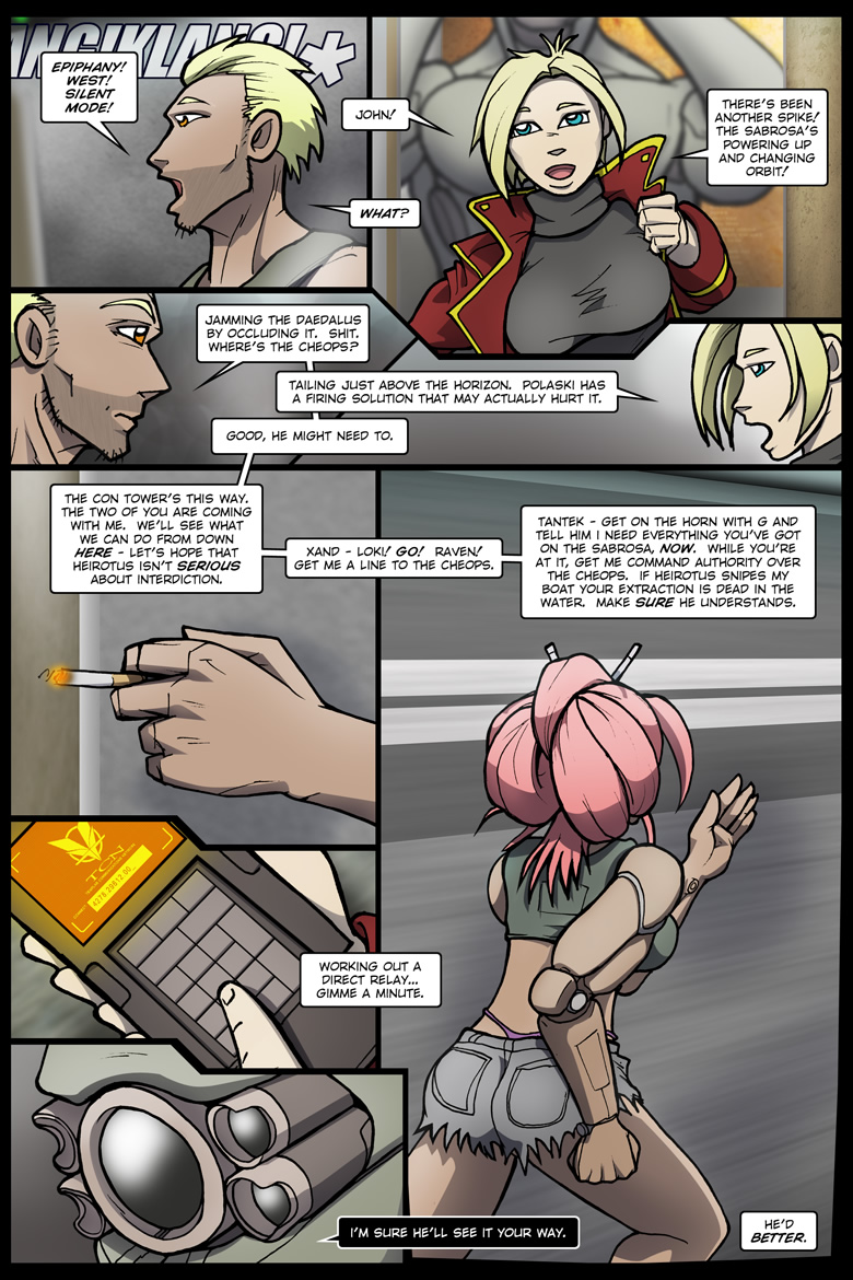
Despite panel one being the reference image for West for many moons, I totally hate this page. I hate it bigtime. Like the previous page, re-laid out from scratch… and for the first time, with too much space in the wrong areas. Or rather, space where there doesn’t need to be and no space where there does, or something. Fortunately the rewrite compensates for it, somewhat. As with the previous page, Raven’s screen and keypad have been cleaned up and corrected… which in this case involved a minor reshade in addition to the usual drop-and-transform. I’ve also “bent” the last panel a bit, to help ease into the next page.
I’d have done more in the way of cleanup, but let’s be realistic – this one’s a stinker!
Mastering notes, 2016.12.06 – Minor adjustment to Xand’s bangs in panel eight.
